Monday, January 25, 2010
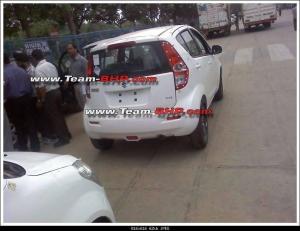
id="post-29"> this is Splash’s back view. The tail lights look ghastly on this one. I am hoping against hope that the production version
style="text-align: center;">
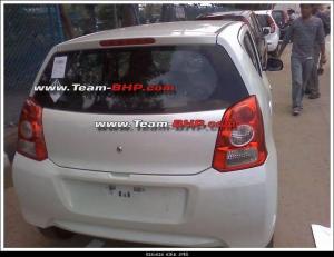
This is the back view of A-star (Something inside me just doesn’t like the name, what are they going to come up next B-star, C-star!!). The A-star is due for release this October. I must admit that this looks much cleaner and neater than the concept vehicle kept at the last Auto Expo. Couldn’t help but notice, that the whole form and appearance looks like a pumped up Alto from the back, even the tail lights ![]() Also notice the funny top right angle , hope its some image problem
Also notice the funny top right angle , hope its some image problem ![]()
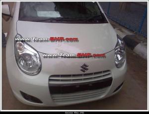
This is the A-star from the front. Looks cute doesn’t it. Here is Maruti-Suzuki’s answer to i10. And a mighty good one at that, I would say.
Here comes the good part. The one thing that just jumps put from this pic and stands in front of you is the separate tachometer. I don’t know if you are able to take it down your throat but my first reaction was WOW! The other thing you notice is that Maruti is doing what I call Re-Usability (a term I as a software guy tend to overuse ![]() ) You can see that the steering, the gear, the A/C vents are one of the things which come as a standard on most models, be it SX4, Dezire or Swift. The fascia looks clean. Nothing seems out of place. Now me and my friends digressed on which car’s dash was this:
) You can see that the steering, the gear, the A/C vents are one of the things which come as a standard on most models, be it SX4, Dezire or Swift. The fascia looks clean. Nothing seems out of place. Now me and my friends digressed on which car’s dash was this:
1. In 4th pic, the car which ever it may be is white in color.
2. Look closely at the 4th pic and u wud find one paper kept on the dash.
3. Now look at the front view of both white A-star and Splash. The A-star is the one with one paper on dash. The white Splash has a paper stuck onto the windshield too.

